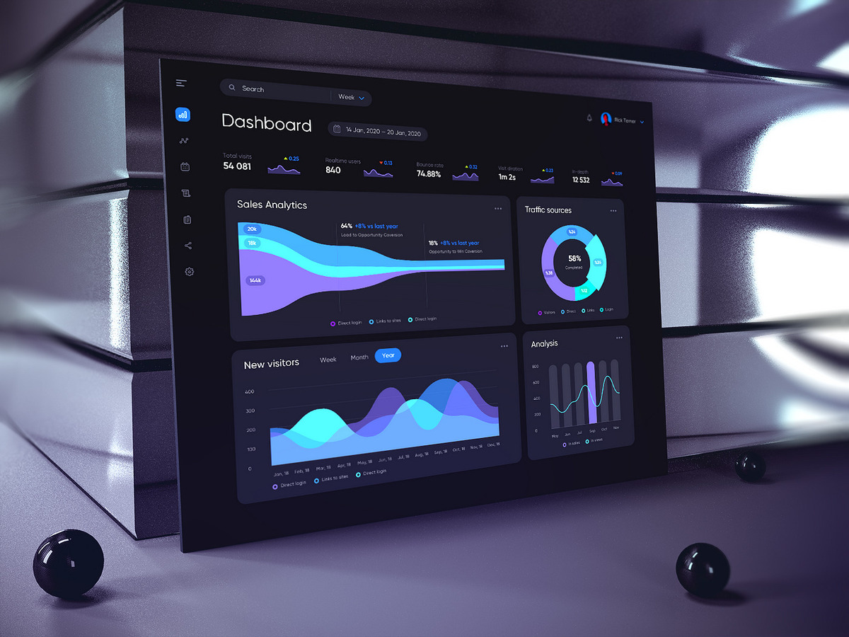
The Role of Widgets Within a Smart Dashboard
Widgets serve as the primary interface in many smart app dashboards. They allow users to access and control real-time information. Creating custom widgets is not just about enhancing aesthetics—it also simplifies access to essential data. When the layout matches the user’s actual needs, system use becomes more effective.
In apps such as smart home systems or logistics platforms, default widgets often fall short. For example, an energy monitoring app may require a single panel to show hourly usage, forecasts, and cost breakdowns. If default tools can’t accommodate this, a custom widget must be built.
This approach gives developers greater control over the user interface, ensuring it aligns closely with the app’s core purpose.
Selecting the Right Data for the Widget
Before designing a widget, it’s important to determine which data is most valuable to the end user. Not all available information needs to be displayed. In many cases, simplicity leads to better usability. Choosing the right data helps prevent dashboards from becoming cluttered or overwhelming.
For instance, in the case of traffic data, it may be unnecessary to show the full log history. A summary of delay times or congestion levels is often more useful. A clear data focus allows for more intuitive widget design.
This level of focus enhances the overall user experience—not just as a design choice, but as a functional strategy.
Building a Visually Light and Functionally Effective Layout
Widget design should be clean and user-friendly. Fewer colors and straightforward visuals help present information clearly. But beyond looks, the design must be practical for daily use. If the layout is confusing or cramped, users may avoid using the dashboard altogether.
Take a temperature monitor as an example. If it displays five charts in a small space, users might find it difficult to interpret. A better approach is to use a large numeric value for the current temperature with a small trend chart underneath.
Clear widget design supports better and faster user decision-making, even in time-sensitive scenarios.
Integrating Real-Time Data Sources
What makes a dashboard “smart” isn’t just its appearance—it’s the speed and accuracy of the data it presents. When developing custom widgets, real-time update capability is essential. Even a few seconds of delay can lead to incorrect decisions.
Imagine a warehouse using widgets to track delivery trucks. If the latest location data isn’t reflected immediately, dispatch operations may be delayed. This is why the widget must be built with proper API integration for live updates from the start.
Such integration builds user confidence, ensuring the data displayed on-screen reflects real-world conditions.
Considering Responsiveness and Device Compatibility
Today’s users access dashboards on more than just desktops. Many rely on tablets or mobile devices. Widgets that aren’t responsive can hinder the user experience. This makes adaptive design crucial—each widget should display properly across all screen sizes.
For example, a chart that looks great on a laptop may be unreadable on a phone. It should automatically adjust, perhaps by stacking views or hiding non-essential elements when space is limited.
It is the developer’s responsibility to ensure the user experience remains consistent, regardless of the device.
Implementing User Control and Customization
Not all users have the same needs. A technician may prefer detailed logs, while a manager may only need summary data. Therefore, widgets should allow for user customization based on role or preference.
Options might include a toggle for advanced views or drag-and-drop features for reordering widgets. This flexibility allows users to tailor the interface to their workflow.
Empowering users in this way increases engagement and enhances the overall usefulness of the system.
Handling Errors and Providing Data Fallbacks in Widgets
Connection issues or API failures are sometimes unavoidable. A widget should not crash or disappear entirely in such cases. Instead, it should display a clear error message or fallback content to preserve context.
If an energy usage widget can’t retrieve live data, it can show the last valid reading along with a note, such as “last updated 2 hours ago.” This prevents confusion and maintains dashboard functionality.
Such thoughtful error handling demonstrates a mature, user-focused design philosophy.
Using Lightweight Technologies for Better Performance
Smart dashboards are not always deployed on powerful machines or high-spec servers. Many applications are accessed via mobile devices, embedded systems, or remote terminals with limited processing capacity. For this reason, widgets must be developed using lightweight technologies that minimize resource consumption while maximizing efficiency. Heavy scripts and unoptimized components can drastically reduce performance, especially when multiple widgets are rendered simultaneously.
In practice, technologies like SVG (Scalable Vector Graphics) are often favored for data visualization due to their minimal impact on system resources. Lightweight JavaScript libraries or optimized frameworks such as Svelte or Alpine.js can also offer performance advantages compared to bulkier alternatives. Additionally, implementing client-side caching strategies or data throttling can reduce unnecessary data calls, decrease server load, and ensure smoother interactions across the dashboard.
Responsive, real-time dashboards demand fast performance as a baseline expectation, not a luxury. In mission-critical environments—such as healthcare monitoring systems or logistics control panels—delays in widget responsiveness can compromise operations. Therefore, lightweight technology choices are fundamental to maintaining both speed and reliability in live applications.
Establishing a Testing Loop for User Experience
Thorough testing is a non-negotiable step in the development of custom widgets. Different users interact with dashboards based on their specific roles, and each may encounter distinct pain points. For instance, an administrator may focus on configuration and system controls, while a frontline operator may prioritize ease of navigation and quick access to essential data. Understanding these variations requires deliberate testing across user segments before full deployment.
A controlled pilot phase can be effective in this process. Releasing the widget to a small, diverse group of users enables developers to collect feedback on usability, visual clarity, and operational relevance. Usability testing in real-world conditions can reveal overlooked issues such as ambiguous icons, cluttered layouts, or confusing interactions—issues that internal technical testing might fail to detect.
By establishing a feedback loop and iterating based on real user input, developers can refine the widget for maximum impact. This approach ensures the final product is not only technically sound but also intuitive and aligned with user expectations. A structured testing cycle transforms a basic feature into a dependable and well-received tool.
Adding Value to the Overall Dashboard with Custom Widgets
A well-designed dashboard goes beyond displaying data—it becomes a strategic platform for informed decision-making. Custom widgets act as the primary interface through which users interpret and respond to key metrics. They serve as dynamic windows into system performance, user behavior, or operational efficiency. When tailored effectively, these widgets eliminate noise and emphasize what truly matters to the user.
Each widget contributes to the system’s overall coherence and functionality. For example, a logistics dashboard might include a real-time map widget for fleet tracking, a weather forecast module, and an inventory level tracker. When these elements are built with a clear understanding of the end-user’s goals, they form a powerful ecosystem that enhances responsiveness and situational awareness.
The true strength of a smart dashboard lies in its ability to turn data into action. Custom widgets, when strategically implemented, become more than aesthetic additions—they are essential instruments of insight and productivity. Their value is realized when they align perfectly with user intent and business objectives, empowering every decision made through the platform.
No Responses